
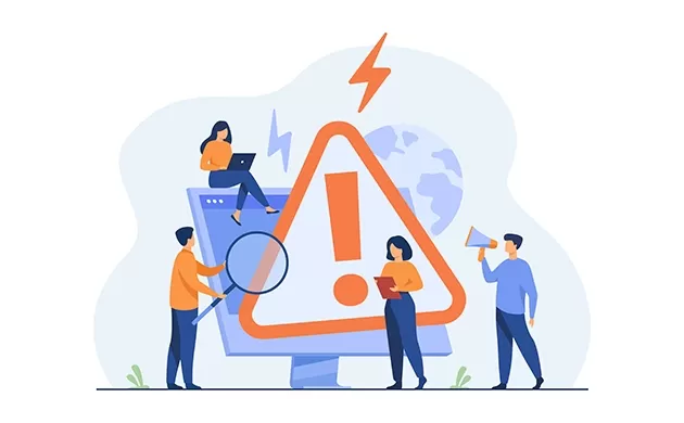
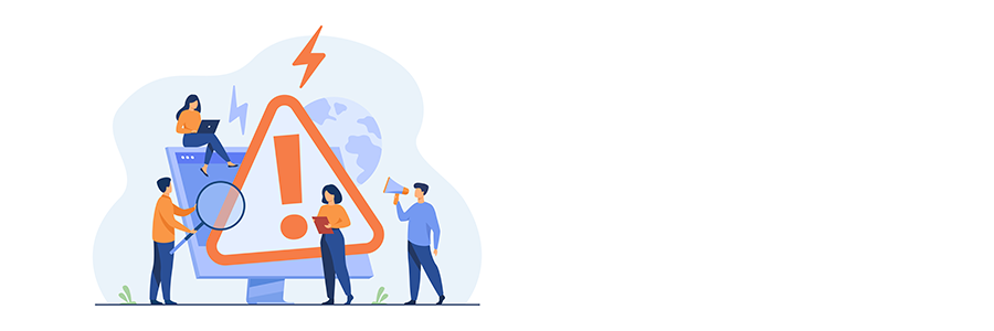
Every business wants a website that looks professional, but sometimes designers try to get there by showing off everything they can do with a website, whether it’s valid or not. A lot of business websites have things on them that are annoying or off-putting to users.
Designing a Website in Trivandrum Kerala, the based developer we provide the best way to look for a good and quality website which is most important for a business site as well as another website also for making that easy for people to find the information we are providing some mistake that can make commonly by website designer or developer while developing website design.
1. Putting visitors through the registration process right away
When you first go to the websites of many businesses, you have to fill out a long form to register, sign up, or do something similar. Give the guest at least 30 seconds to look around, then show them a small pop-up asking for their name and email address. Getting more people to sign up will be easier.
2. Using fonts that are too complicated or artistic
Fonts that are too complicated or artsy could be a problem. Unique fonts can add to a site’s visual appeal and brand personality, but they can also make it harder to read, especially on smaller screens or for people who can’t see well. This could make users upset and lower their interest or sales rates.
3. Autoplay Videos Or Audio
Avoid auto-playing videos or music. Web designers should instead give users control over multimedia elements by letting them choose when and if they want the material to play. This improves the user’s experience, avoids interruptions, and considers the user’s tastes.
4. Too many ads
Too many ads hinder user experience and worsen the site’s layout score. Instead, designers can use less annoying options like in-content ads or ads that look like they belong there. They should set aside room for ads ahead of time to keep the layout from changing and ensure they load quickly. By putting the user experience first, you can attract a good audience.
5. Not including important information about buying
We’ve all been stuck on a website where we had to call or email for price information or a product demo. It makes sense for the business, but it can turn off possible customers and hurt your sales process instead of helping it. Making your demos, price sheets, and feature sheets available on demand can help you get more leads, even if you need an email address to get to them.
Website Design Services
6. URLs with a lot of words
Using too many subfolders in URL strings could be better for websites. If a reader digs deep into your site, they may end up on a page with a URL with too many subfolders. It means the URL is very long and has a lot of forward slashes. In many cases, it’s more complicated than it needs to be. To prevent this problem, the URL string should be made shorter.
7. Navigation: Too Much
It’s easy to focus too much on navigation because you want everything to be in one place. Unfortunately, this method is complex for people to use. Customers end up irritated because they need help finding what they want. After all, it’s buried under several layers of navigation. A well-designed website has menus that can be used and valuable information based on what the user wants to do a best Designing a Website in Trivandrum Kerala.
8. Sliders
Even though sliders have been shown to lower conversion rates, make pages take longer to load, and need to be more generally well-optimized for mobile, many designers still insist on using them. Take the time to ensure the messages above the fold are designed with the primary audience in mind. Try to avoid cramming ten value statements for five characters into one paragraph. Less is more.
9. Downloads that need email addresses
In the healthcare business, downloading white papers is a problem. When a website offers free content, trying to get email addresses for marketing can annoy users. Also, some websites call the user immediately after downloading, which is annoying.
10. Using animation and moving text too often
More moving text and motion are annoying. No one cares that your website has text and pictures coming at them from all sides. It takes attention away from the topic and makes it hard to concentrate. You want to get people to buy or download your product or service. You don’t want to impress them with useless stuff.
WordPress Website Development
11. Multilevel Hover-Over Menus
Hover-over menus with more than one level needing to be clarified are annoying when used for top-level navigation. Users should be able to quickly get to a company’s “Products” or “About” pages without moving their mouse to just the right spot to click on a submenu item. Instead, Web creators should use top-level links instead of cascading menus.
12. Too Much White Space
Pop-ups, interstitials, and media that start playing on their own are all problems, but there’s a much easier way to make websites
more useful for visitors: Lessen the empty room. Yes, you need some air to create a good design, but you also want to ensure people can find the information they came for. The more valuable a page is, the less they have to scroll.
13. A search feature that doesn’t work
A search bar that doesn’t work well is the most annoying part of a website. All too often, when users type in an easy search query to find an obvious answer, they get either nothing or a thousand results that are different from what they were looking for. If your site needs to be set up for an internal search, leave it out and give visitors a site map instead.
14. Personalized Cursors
Custom cursors (like when you move the cursor over an email address and it changes into a letter) are a great way to improve UX and show off your brand. But the whole design is often built around making the most of the cursor’s design value. If all calls to action are taken off the page, and the cursor is the only call to action, users have to hover over items to figure out what they mean. Use the mouse to make the user experience better instead of the design.
15. Excessive Pop-Ups
Pop-ups on websites can cause more trouble than they solve. Web designers can give users useful information without getting in the way of their browsing experience by using less intrusive methods like banners or notifications built into the page’s layout. This keeps people from getting upset with the Designing a Website and makes it easy to use Trivandrum Kerala.
16. Not set up for mobile use
When a business website isn’t made for mobile first and needs to be adaptable, it’s a big problem. Design files for mobile platforms should be created before those for desktop browsers since almost all users are on mobile platforms. If a website takes too long to load or looks wrong on a mobile device, it’s a no-go.
17.Website Chat Support
Chat windows that get in the way Chat windows that pop up, follow you around a website, and hide important buttons you want to click are like a salesman
who is low on his quota and sticks too close to you in the store.
18. Carousels that move on their own
When users don’t have to do anything, auto-scrolling carousel elements that move on to the next item on their take away their power. They push content onto the user, making it more likely that they will miss important information before they can read it all. Giving users manual controls and a slower speed shows more care for their time and lets them take the lead at their own pace.
19. Forms for ‘Contact Us
When users don’t have to do anything, auto-scrolling carousel elements that move on to the next item on their take away their power. They push content onto the user, making it more likely that they will miss important information before they can read it all. Giving users manual controls and a slower speed shows more care for their time and lets them take the lead at their own pace.
20. There are too many widgets.
Widgets can add features with little work from developers. But they can lead to bad things. Have you ever clicked on a story, and when you did, your screen was filled with ads? Using more than one tool can make the experience feel similar. Widgets on both sides of the desktop work. But it feels crowded on mobile. Ask, “What do your users care most about?” Only put that in.
system engineering and infrastructure.
Designing a Website in Trivandrum Kerala