
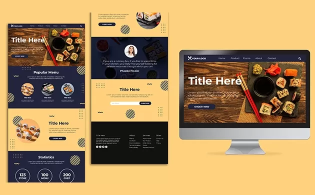
It’s sad to hear business owners complain about the hundreds of clicks they get but very few conversions. The results are the same, even after double-checking for broken links or submission buttons and analyzing the target audience more closely. Some of the important points such as Landing Page Mistakes and solution are mention below.
A professional Web developer in Kerala can examine your website to determine the cause of such errors. Poor landing pages are sometimes the root cause of low conversion rates.
There are many ways that freelance web developers in Dubai could help increase your conversion rates. But the best way to do this is with a great landing page. Because landing pages are an integral part of every inbound marketing strategy, they are essential to a company’s success.
Visitors only have a few seconds to decide if they want to stay on your site or go elsewhere when they land on it. Converting visitors can be increased by appealing to them and grabbing their attention. Your landing page can instantly make or break your company.
Your traffic will likely buy from you if your landing page is quality. It is essential to know what makes a wrong landing page and how to avoid it. These are five common landing page errors that can ruin your conversion rates and why you should avoid them. check out Landing Page Mistakes which can be overcome.
What’s next?
1. Unklare CTAs
A generic call-to-action (CTA) button on your landing pages is the most uninviting. CTAs like submit or ‘click here’ need to be more convincing for your visitors to click on the landing page. They need to do what they want.
Even though it may seem insignificant, your CTA words can significantly impact your conversion rates. It is why it is essential to invest heavily in your landing page CTAs. To start, visitors can see the next step by visiting specific keywords placed strategically on your CTAs. These expectations are essential for building strong customer relationships.
Clear and transparent call-to-action buttons will discourage readers from taking action. Be clear about your words. Instead of generic terms like “download”, you can use more specific phrases such as “Get your free ebook now.”
2. Loading time lag
Your website’s speed is essential in search engine optimization (SEO). It helps you rank and attracts traffic to convert. If the page takes longer than five seconds, 74% of site visitors will abandon you.
Your visitors will be satisfied if your page takes less time to load. Website speed is the most critical aspect of a site or business for Landing Page Mistakes.
Here are some factors freelance web developers recommend you consider to help you decide where to go.
- Slow hosting provider
- Poor image optimization
- Unclean web coding
- Too many server requests
- Huge web files
3. Forms that are too complicated
It isn’t surprising if you have ever loaded a page only to be asked to fill out a form. Even though most people need help understanding this, complicated landing pages can turn off large portions of your visitors. Sites that require visitors to enter information other than their blood type can be a problem as people are so concerned about their data.
Your landing page is the awareness stage of a buyer’s journey. They are looking for answers to any questions or problems they may have. Let them know that you are ready for their solutions and will not try to give them another hard time.
If a pop-up is required, ask your readers only to fill out their email addresses and name. Strong relationships will develop by starting small.
4. Crowded design
Always keep in mind conversion-centered design when optimizing landing pages. Limit your choices to the actions you want your visitors to take. Simplicity is key. A cluttered plan will only frustrate your visitors and cause them to abandon your site, increasing their bounce rate.
Reading is fast becoming obsolete in the digital age. Ensure that your text is only a few letters long so that readers can quickly scan your page and understand what each action does. Avoid distracting formats, hard-to-read fonts, and jarring colors. Also, avoid too many headlines competing with one another.
5. Uncertainty in your ad design
Getting hundreds of clicks on your ad is simple, but it can be challenging to convert traffic. Marketers need to avoid disconnecting the advertisement from the landing page. You might have seen an ad with an eye-catching design that leads to a landing site with a different look and feel.
These two will be separated so that visitors will require clarification. To increase conversion rates, avoid creating a visual disconnect.
The following post will address five new web design trends, which include accessibility, UX, and responsiveness. We’ll also discuss ten websites pre-built by BeTheme, demonstrating how to use them.
BeTheme has 268,000+ downloads and a rating of 4.83/5 stars. It is one of the most highly-rated WordPress themes in the world.
In 2023, here are five web design trends you should be aware of
You must first understand what can affect it to improve it. Web designers know that the “something” is the user’s digital experience. Here are five design trends that can positively impact this digital experience.
1. Hoverable iconography
Web design is about creating intuitive interfaces that require little effort from the user to use. However, shortcuts that make it easy for the designer may have the opposite effect on the user, especially in iconography.
Some icons, particularly those used in headers, are so commonplace that users can easily interpret their meanings and use them appropriately.
The BeBiker 4 website has three icons to the left: 1) Shopping Bag/Cart, 2) Search, and 3) Account.
Beker 4
Users quickly learn to use the same iconography from one site to another.
Designers need help in addressing icons that are less commonly used. Users need assistance in understanding these icons. Giving each icon a brief description may be helpful, but this could lead to clutter in a design.
A hover-triggered helper message is a way to meet users’ needs and avoid clutter.
This trend is best illustrated by the BeJeweler 2 website:
Bejewelled 2
There are other uses for helper text. We can use it to hover over product icons and variant swatches. It provides a lot of information but is manageable and allows users to navigate the site’s offerings confidently.
2. Social proof:
Trust is an essential factor in building personal and professional relationships. It is valid for relationships between customers and brands. To build trust, well-informed web designers will use trust marks and social proof in 2023.
These trust builders help in many ways on websites. One way is to have a section on your home page dedicated to reviews or testimonials.
It is what the BeDoctor website does use social proof:
BeDoctor
BeDoctor has three types of trust-building content available:
- Customer satisfaction rating
- Client feedback
- An average customer rating.
It can be linked to a rating platform such as Google or Yelp.
Businesses may need to create more social proof for trust-building purposes and instead rely on trust marks.
A symbol next to the “Checkout” button is an example.
A second approach is to add context to website claims, as BeMarketing 2 did:
Marketing 2
Below is an explanation of the asterisk next to “threefold”. This explanation could be either a short textual statement or a link on a page that documents the claim.
3. Mobile-specific features
Responsive design has become much easier thanks to the simple rules and guidelines that many web designers know. Many WordPress themes are responsive and can be used on any device.
If web designers are in a comfortable zone, it can lead to stagnation and a loss of motivation.
In 2023, mobile-specific features will receive greater attention. However, more attention will be given to overcoming unavoidable frictions and obstacles.
It is addressed in the navigation design of the language’s four websites.
Language 4
All non-mobile page links are intact. However, the “Call Us” button appears at the top of the list rather than at the bottom. It is a minor but crucial navigational divergence.
BeFurnitureStore placed the items that typically appear at the top (accounts, carts, favorites, etc.) on a sticky banner.
BeFurnitureStore
You can count on web designers working to revolutionize the mobile web experience to provide more robust solutions over the coming years.
4. Texturization of shapes
When skeuomorphism was a rage, many natural-world textures were displayed on our phones and desktops. This “cutting-edge trend” became more and more distracting.
Digital texturization does not have to be a negative thing. You will see that web designers will use organic shapes in 2023 to create small, strategic textures. It is evident in the BeRenovate 5 website.
Betnovate 5
The site’s background uses rounded shapes and lines to soften the imagery while making it visually appealing.
Coaching 3 shows how digital texturization can strategically draw attention towards certain pages.
Coaching 3
This website has two shapes that make it easy to direct visitors’ attention to the places you want. These shapes are available near the right margin of the page. Because users tend to focus their eyes on the left side of a page first, these figures ensure that they can see and interact with as many pages as possible.
5. Additional video
There are many things that users like to look at online. Some people prefer to read blogs, while others like to listen to or watch videos or vlogs.
Website owners and designers can only expect to be able to please one. Loading speeds will be affected if you try to provide personalized content in text and video.
When it seems essential, you can add a supplemental video to the video.
Business 6 continues this approach halfway down its homepage with a full-width section of the video that is hard to miss:
Business 6
Video segments have to summarize the content or show testimonials and other purposes.
You don’t need to make the supplemental video full-width. For example, the section on the pregnancy hero uses a small cutout for video storage.
The “Play” button can be instantly identified, allowing the user to choose to view the video. Considering the subject matter, this is likely the case.
A web designer can maintain acceptable page loading speeds by using videos sparingly and strategically.
What are your thoughts?
Website trends cover superficial website content changes, like exciting colour trends or typographical experimentation.
Nothing is wrong with the previous, but the 2023 web design trends are a significant shift in focus, focusing on accessibility, trust building, and responsiveness.
Landing Page Mistakes

Leave a Reply